Branding for Flourish Real Estate, a boutique real estate agency in Barcelona
We designed an elegant identity, with a logo that works on any sign and business cards that feel great in your hand: a premium image that never feels cold or distant.

Client
Flourish Real Estate
Sector
Boutique real estate agency
Market
Barcelona
The starting point: a boutique real estate agency without an image of its own
Flourish is a boutique real estate agency in Barcelona. It needed a brand that placed it in the premium segment without losing what makes it different: the personal attention every client gets.
Why a premium real estate agency doesn't have to feel cold
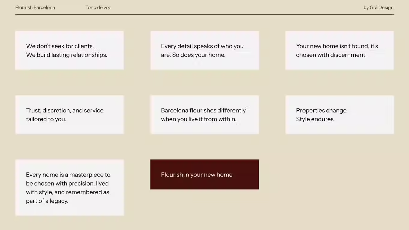
In high-end real estate it's easy to end up with brands that are elegant but distant: they impress, but they don't make you want to call. Flourish wanted the opposite: to convey authority while making clients feel looked after from the very first contact.
What we designed for Flourish: a logo that works on any sign
We designed a restrained, elegant identity, with a logo made to read well on any for-sale sign, from near or far.
We completed it with sales stationery: cards, bags and materials that feel great in your hand and stay with the client throughout the whole sale.
The result: an image that's premium and approachable at the same time
Today Flourish has a premium image that doesn't feel cold, and it's recognised in the same way in every piece a client sees, from the sign on the building to the documents they take home.
Premium doesn't mean distant. You can tell a high-end brand by the care in every detail, not by how cold it feels.




What other clients say
She perfectly captured my essence as a professional and what I wanted my brand to convey.
Priscila Santos