Flourish Real Estate
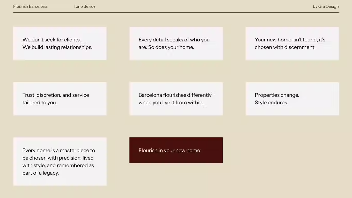
Flourish operates in high-end real estate, where every single detail communicates market positioning. We built a brand identity with authority, without losing the warmth of Priscila, its founder, or the exclusivity that their clients look for.

Client
Flourish Real Estate
Market
Premium Real Estate
Service
Brand strategy, branding, creative direction, logo system, visual system, business cards, flyers
About the project
Flourish operates in the high-end real estate market, where every single detail communicates positioning, trust, and professionalism. The goal was to build a brand identity with authority, without losing the warmth that Priscila, its founder, brings in person to every client.
What we did
We created a complete, cohesive, and recognizable system.
We developed the symbol, typography system, color palette, and usage guidelines so that the brand communicates the exact same way at every touchpoint, ensuring no single piece feels out of place compared to the rest.
A logo that works on its own
In luxury real estate, the symbol must be recognized without text around it, whether on a construction site banner or a business card from afar. We built the logo system keeping that specific use in mind.
The pieces people actually touch
We took great care of the business cards and direct mail flyers, which in the real estate sector remain some of the pieces with the highest direct impact. Someone holds them in their hand before even looking up the brand online, and they feature the exact same level of detail as the rest of the brand identity.
The outcome
A recognizable, elegant, and flexible brand identity capable of transmitting authority without losing the closeness that makes people trust Priscila from the very first meeting.