Kamel
Kamel has been in the selfcare industry since 1932, but their communication sounded like a brand new company. We organized the message and built an identity that reflects that real experience.
Client
Kamel
Market
Dermopharmacy
Service
Brand audit, strategy, rebranding, visual identity, packaging, creative direction
About the project
Kamel is a brand founded in 1932, with a solid track record in botanical formulation. They had plenty of history and credibility, but needed to organize their messaging, update their visual identity, and define a clear direction for the present, without losing that heritage.
What we did
When we started looking at how Kamel communicated, we found something curious: a brand with almost a century of real experience was speaking exactly like any competitor that had opened just last year. That experience was there, in the formulation, in their track record, in the trust that many clients already had, but it wasn't visible anywhere on the brand.
Research before designing anything
Before touching a single color or typography, we researched the real history of the brand since 1932, how people perceived it today, and what the rest of the brands in the sector were doing to differentiate themselves. That previous work was what allowed us to see clearly that Kamel didn't have a product problem; they had a communication problem.
Defining the tone before the logo
With that information, we decided what the brand had to represent from now on: pharmaceutical rigor as a foundation, a botanical language that didn't fall into the typical exaggeration of the sector, and a way of communicating that generated trust by explaining, not promising.
Making the brand recognizable everywhere
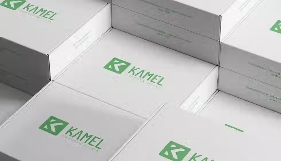
That same tone and criteria were then applied to the visual identity, the packaging, and every material that represents Kamel today, from a label to a newsletter. Consistency is what makes a brand memorable.


