Los Chapines
Los Chapines was born as a tribute to the true origin of coffee. We gave it its own name, brand identity, and custom photoshoot direction so it could stand out in a market crowded with similar brands.

Client
Los Chapines
Market
Specialty Coffee
Service
Naming, branding, photoshoot creative direction, custom logo lettering, packaging, web design
About the project
Los Chapines was born out of a desire to pay tribute to the true origin of coffee and traditional farm processes, designed for those who view coffee as a ritual and an experience. They needed a brand with its own unique character in a market where many look the same.
What we did
The specialty coffee problem
The market is crowded with brands that talk about origin, tradition, and quality using the exact same old words. Los Chapines needed to say it in a way that truly showed the difference.
Starting with the name
We developed a naming strategy that genuinely connected with the brand's origin and values before designing anything else.
Chapin is what people from Guatemala are called, a local term full of roots and affection. Using it in plural, Los Chapines, shifts the focus to the people, those who work on the farm and are a fundamental part of the story behind the coffee.
Branding with character, origin, and values
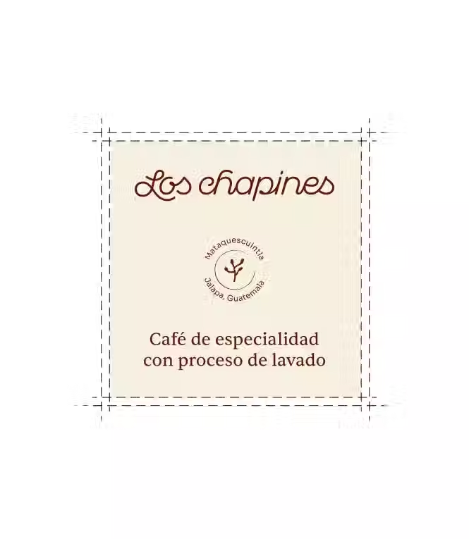
From the name, we built the logo with custom lettering, the packaging, and the complete creative direction, each piece reinforcing the same idea of authenticity and tradition.
Product and lifestyle photoshoot
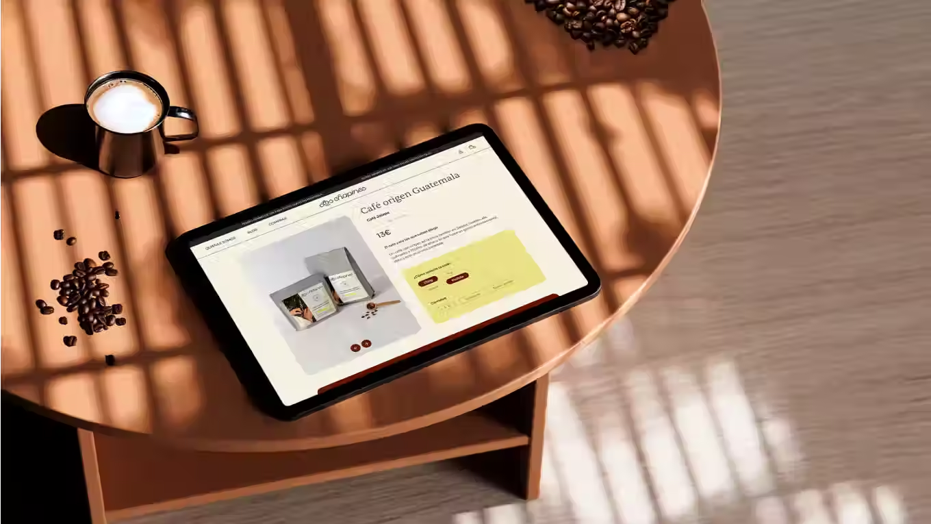
We directed the photoshoot in Barcelona alongside our photographer Gime Zaballa, defining materials, style, and lighting in total alignment with the rest of the brand identity.